
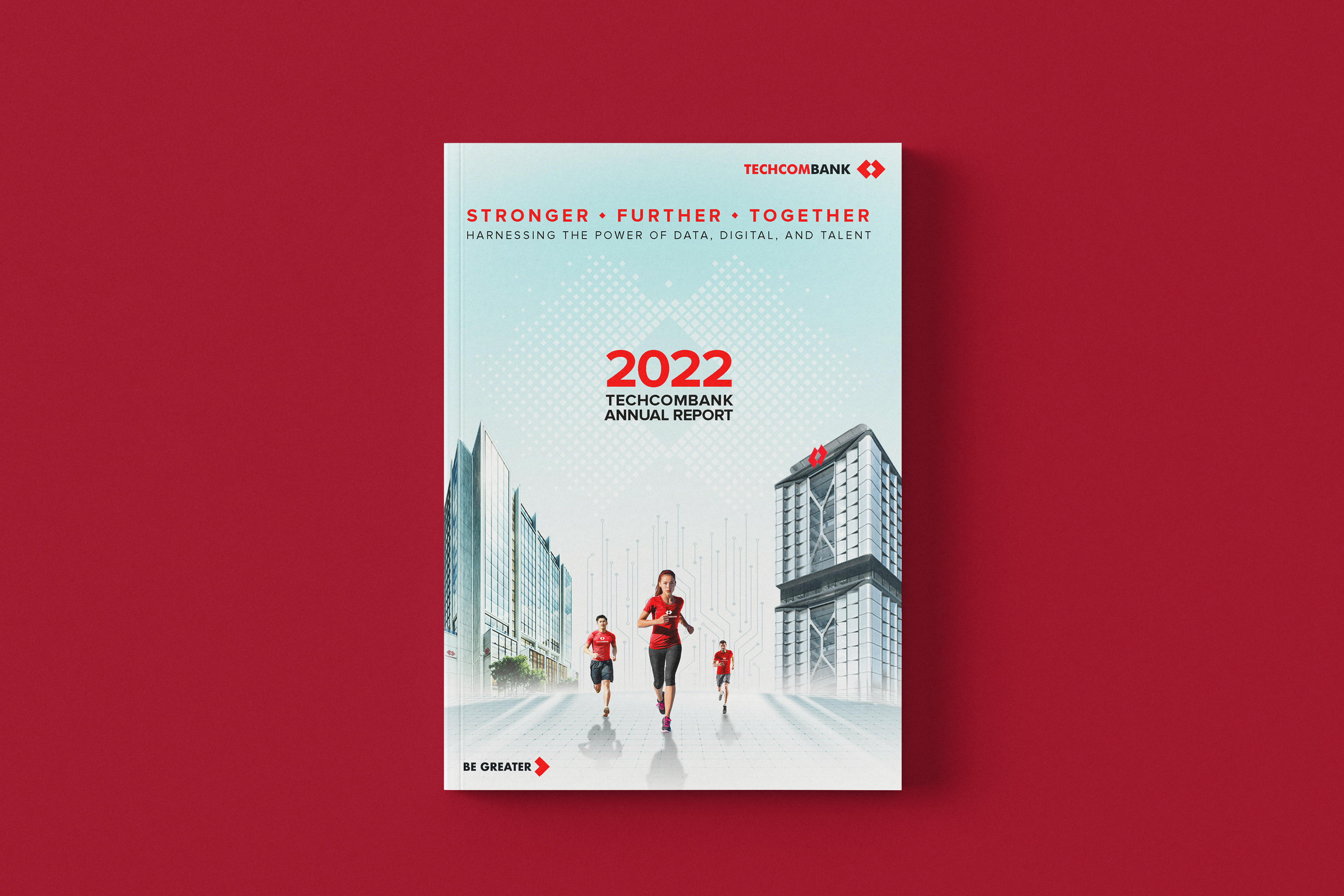
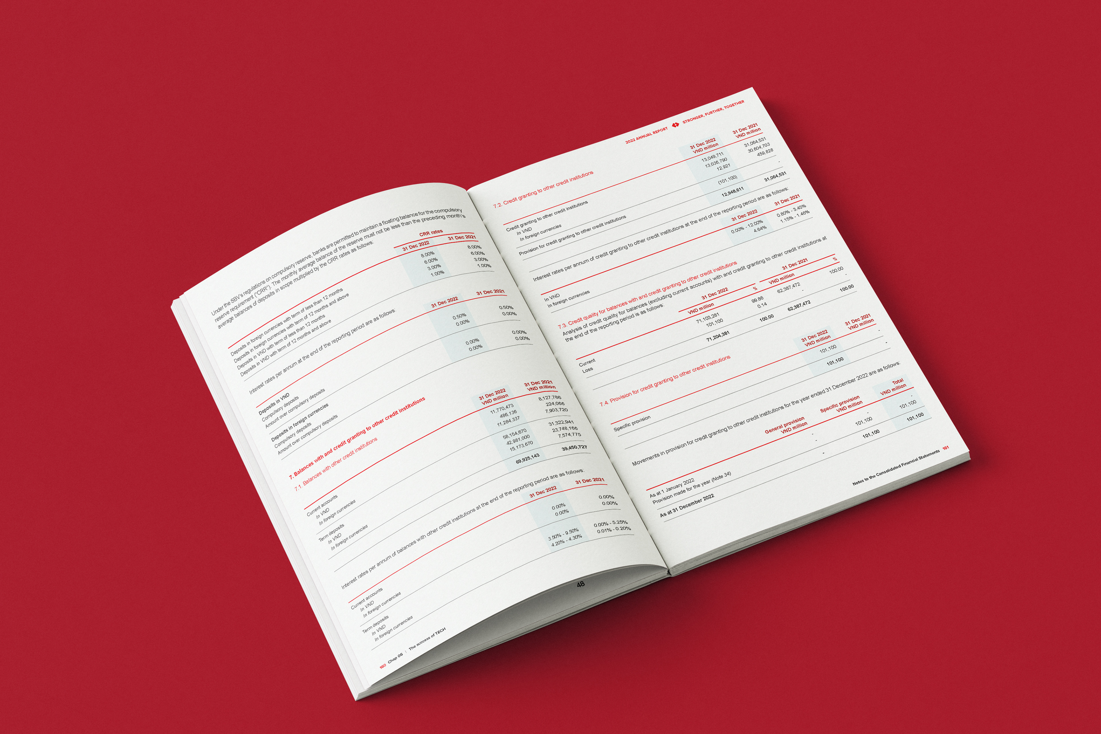
Báo cáo thường niên 2022 của Techcombank là một bài thực hành mẫu mực về việc kết hợp bản sắc thương hiệu với thiết kế biên tập cao cấp. Dựa trên chủ đề 'Stronger - Further - Together', dotworks đã triển khai một hệ thống layout tôn vinh mã gen Đỏ - Trắng đặc trưng của ngân hàng.
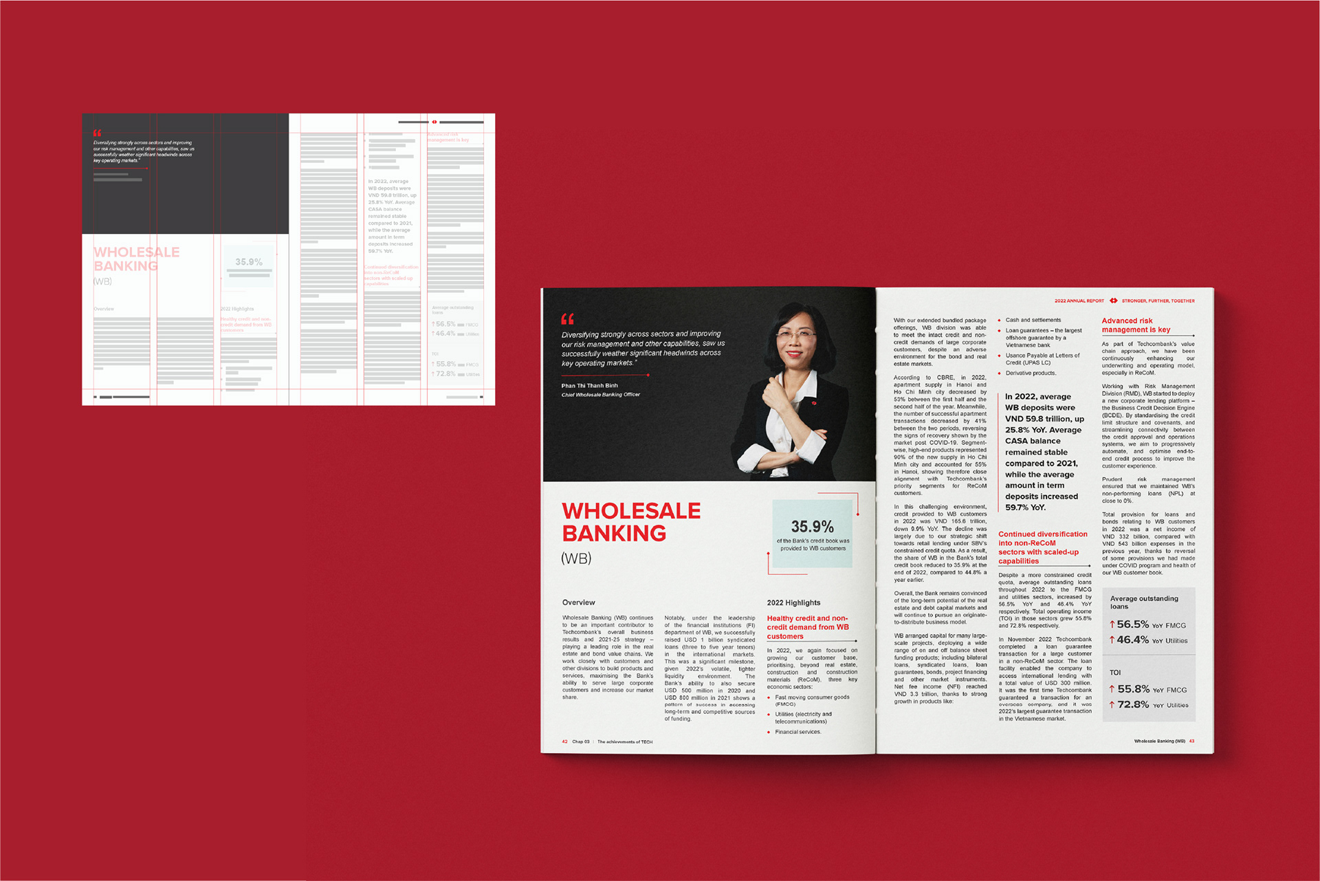
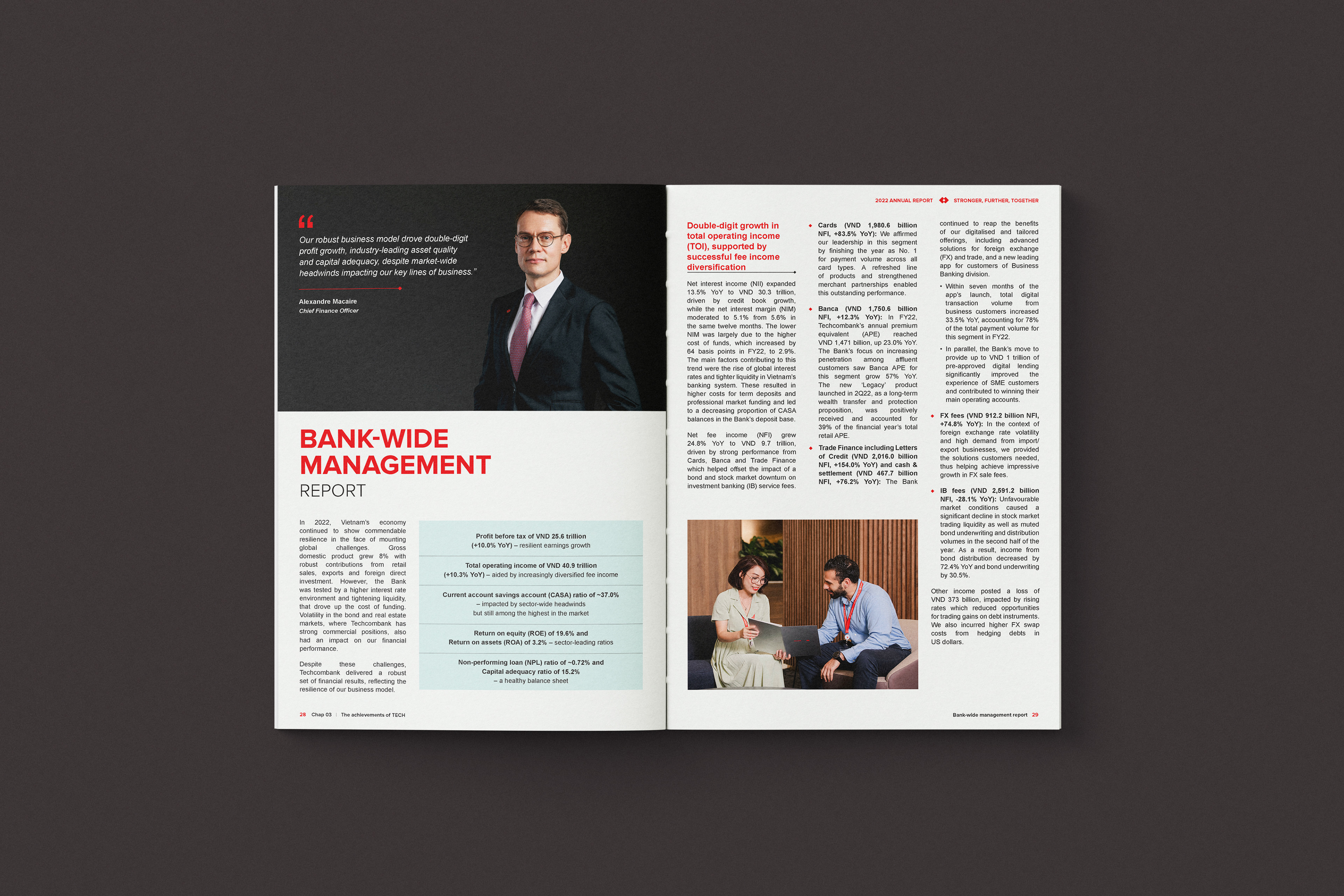
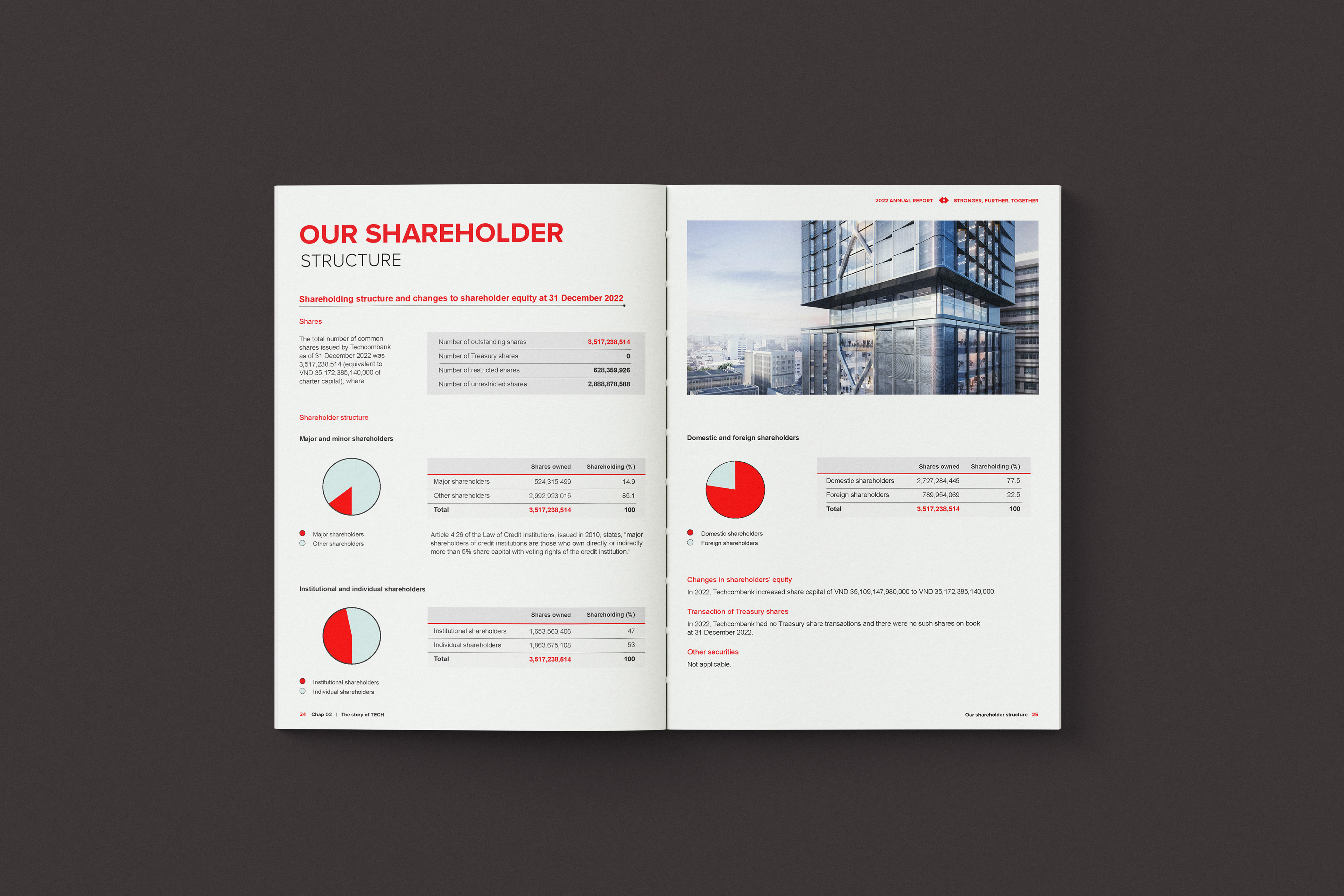
Sử dụng hệ thống lưới 3 cột cổ điển, chúng tôi tạo ra sự cân bằng tuyệt đối giữa các báo cáo tài chính dày đặc và những khoảng trắng 'thở' đầy tinh tế. Linh hồn của dự án nằm ở khả năng Kể chuyện bằng dữ liệu (Data Storytelling): chuyển hóa những thành tựu khổng lồ—như con số lợi nhuận 1 tỷ USD—thành những lát cắt hình ảnh trực quan và đầy sức nặng. Mỗi trang đôi là một sự tính toán tỉ mỉ giữa nghệ thuật chữ và thẩm mỹ thương hiệu, đảm bảo thông điệp 'Be Greater' được lan tỏa mạnh mẽ."
"The 2022 Annual Report for Techcombank is a masterclass in aligning corporate identity with editorial excellence. Under the theme 'Stronger - Further - Together,' dotworks executed a layout system that honors the bank's core red-and-white DNA while pushing the boundaries of professional storytelling.
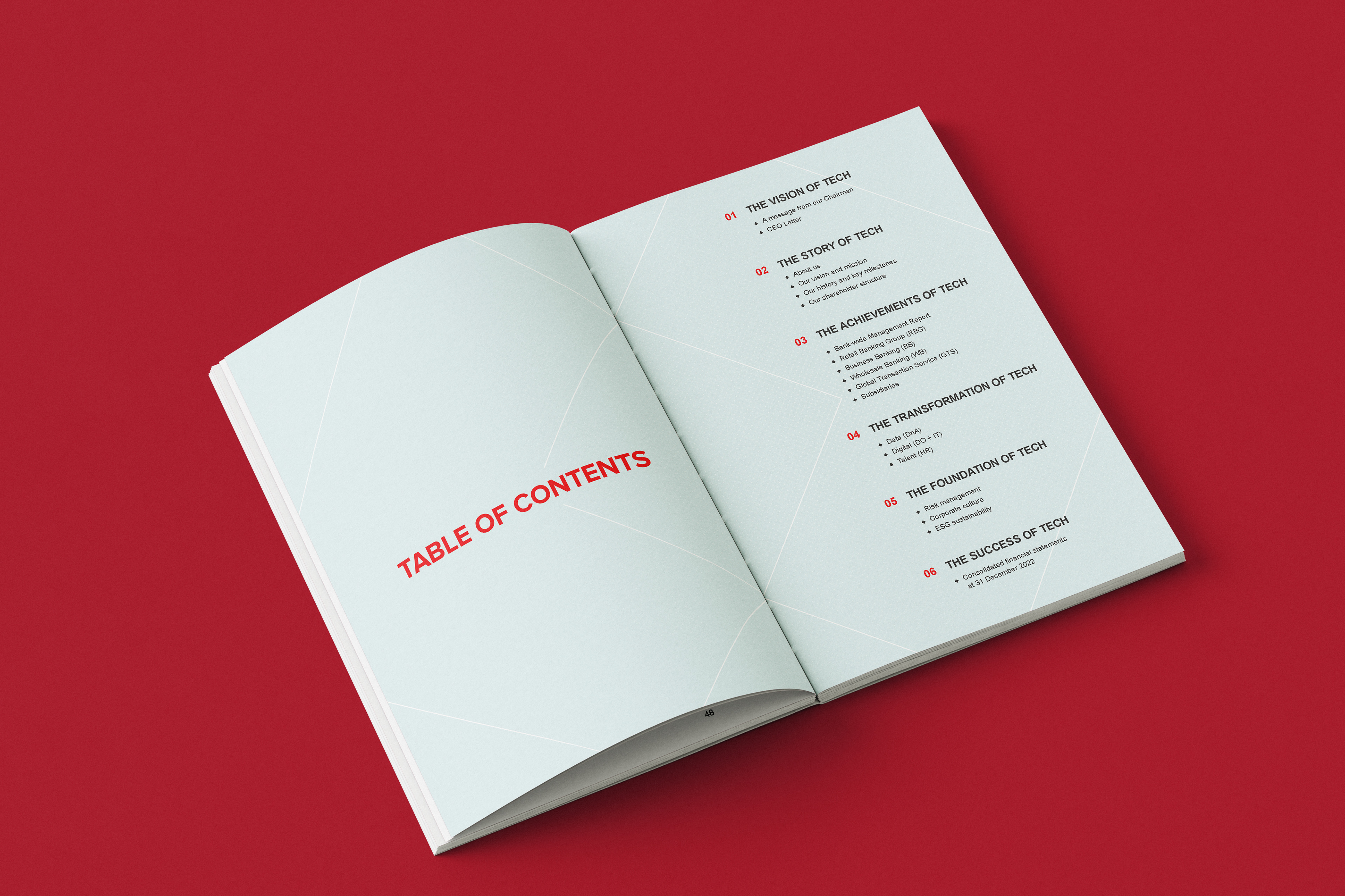
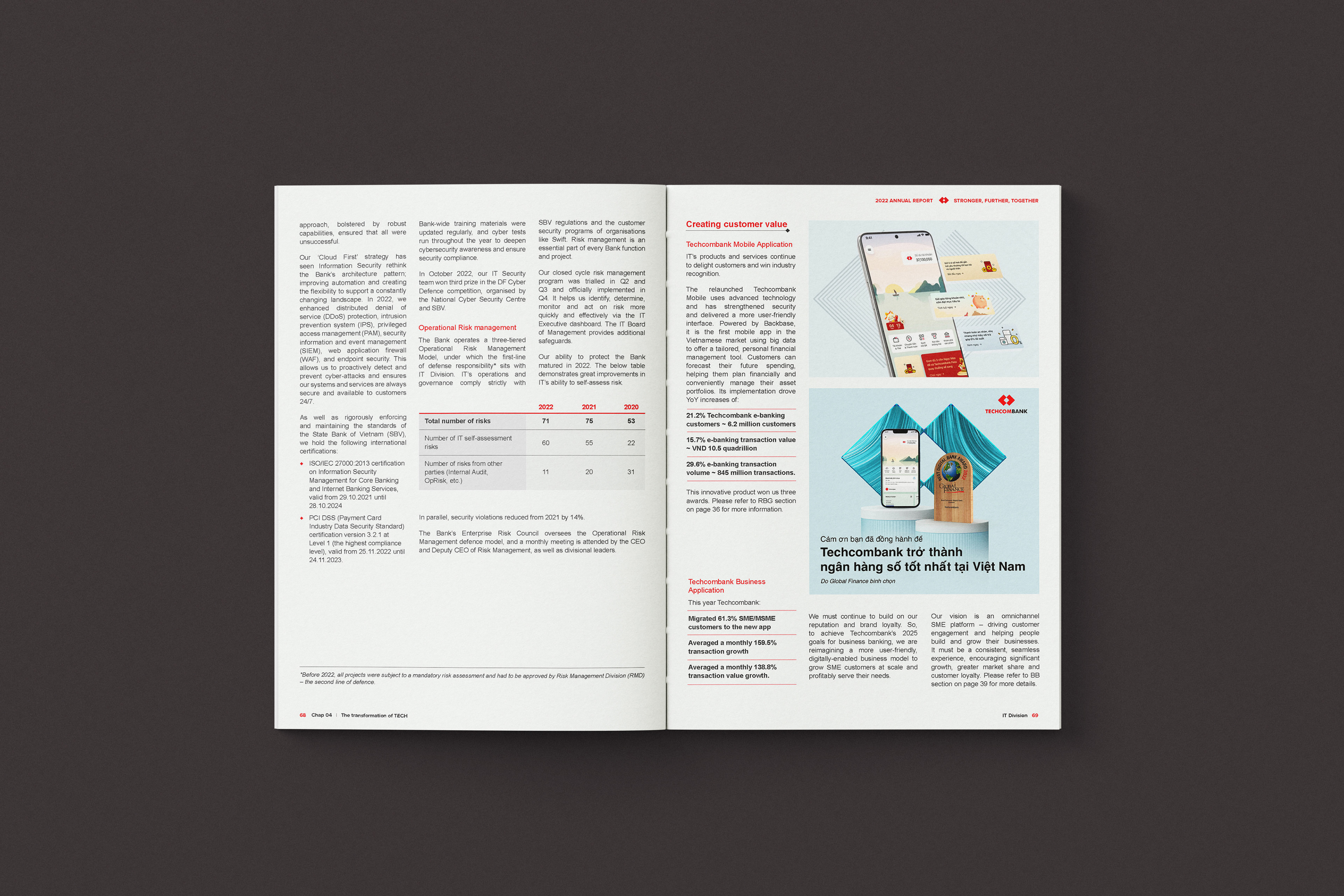
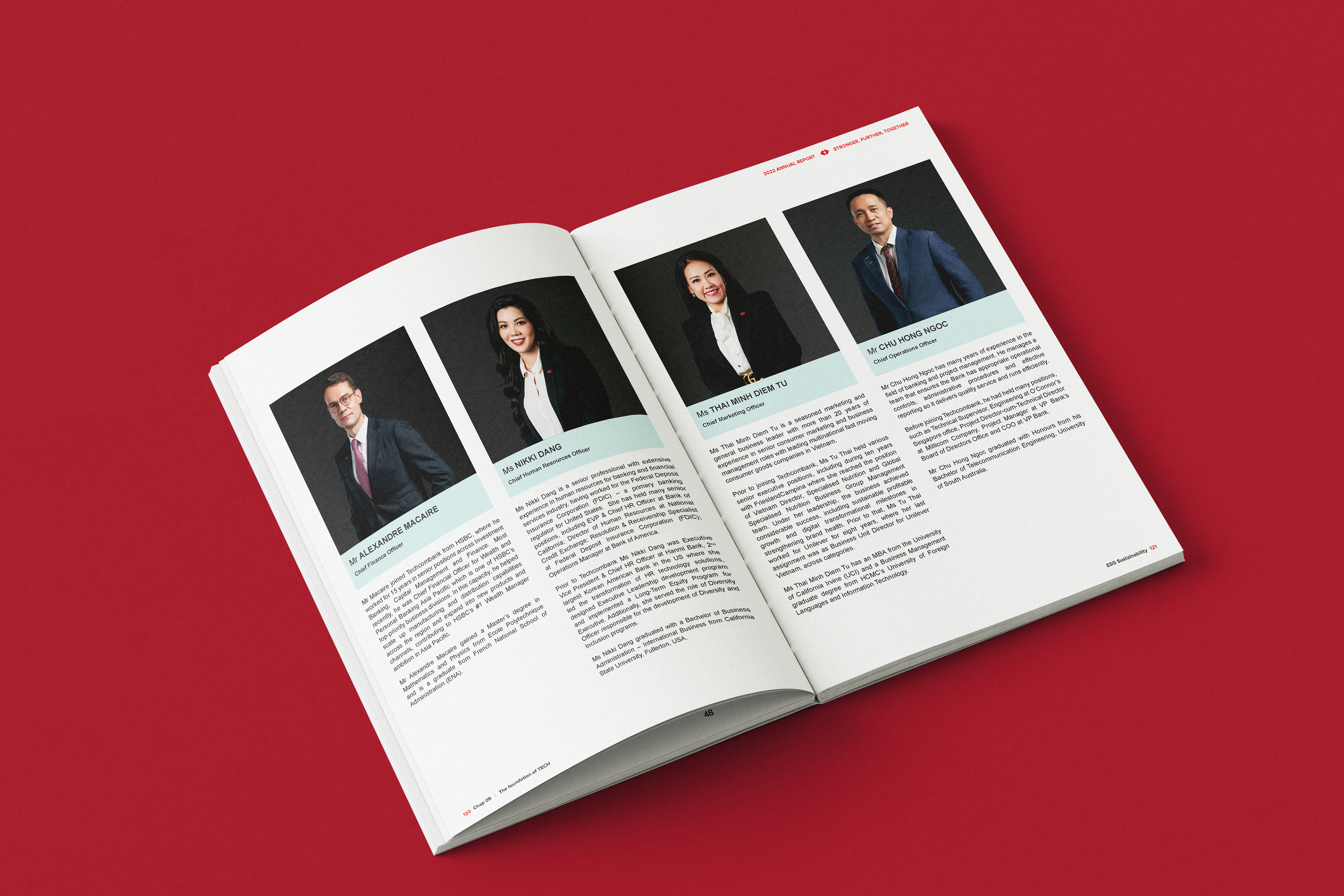
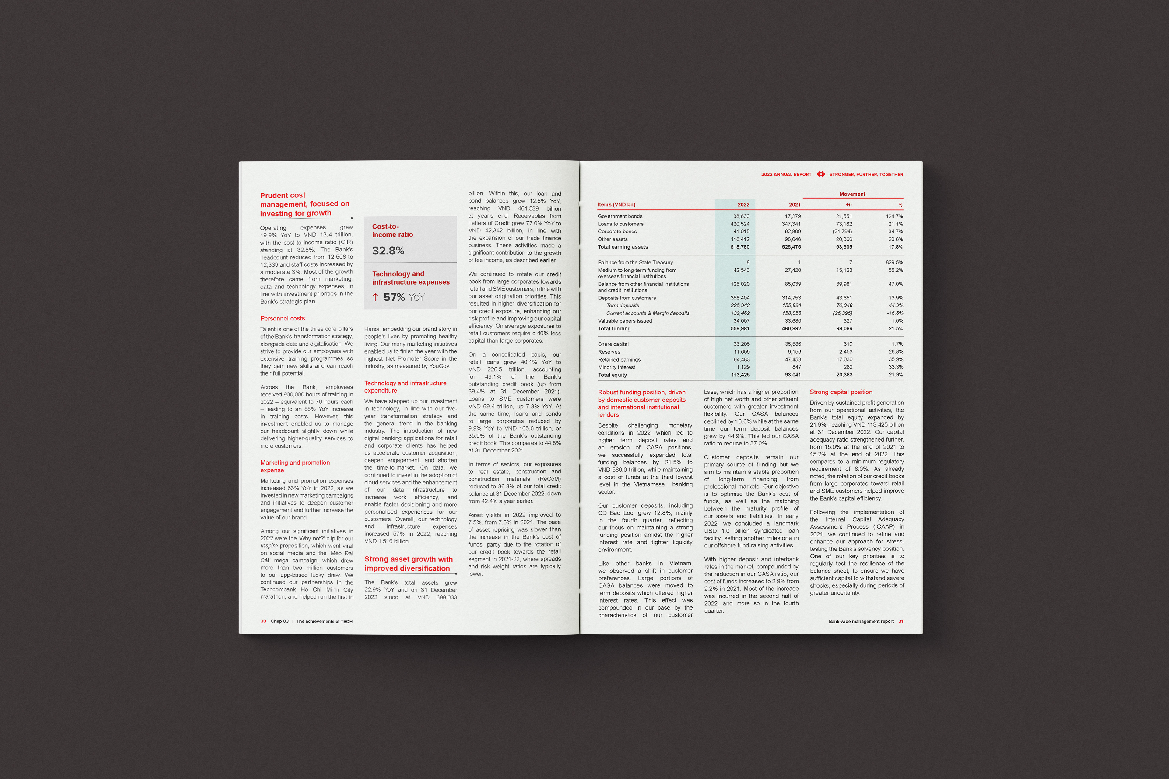
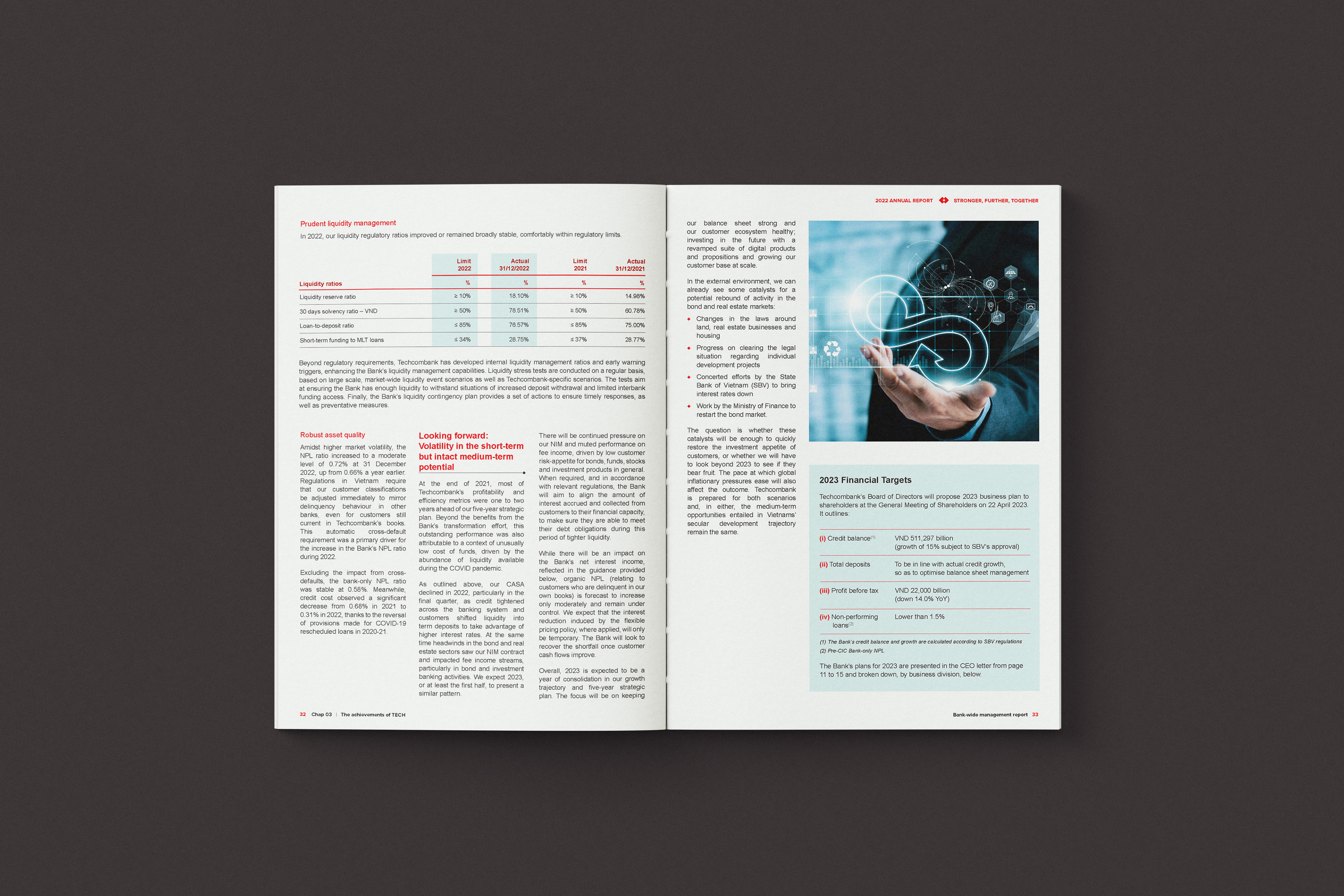
By employing a classic 3-column grid, we achieved a perfect balance between dense financial reporting and breathable white space. The core of this project lies in Data Storytelling: transforming monumental achievements—such as the USD 1 Billion profit—into intuitive, high-impact visual narratives. Every spread is a calculated intersection of precision typography and brand-aligned aesthetics, ensuring the message of 'Be Greater' resonates on every page."
The Art of Visual Balance: Data & Editorial Contrast
Chúng tôi sử dụng độ tương phản về kích thước để điều hướng mắt người đọc một cách chủ động.
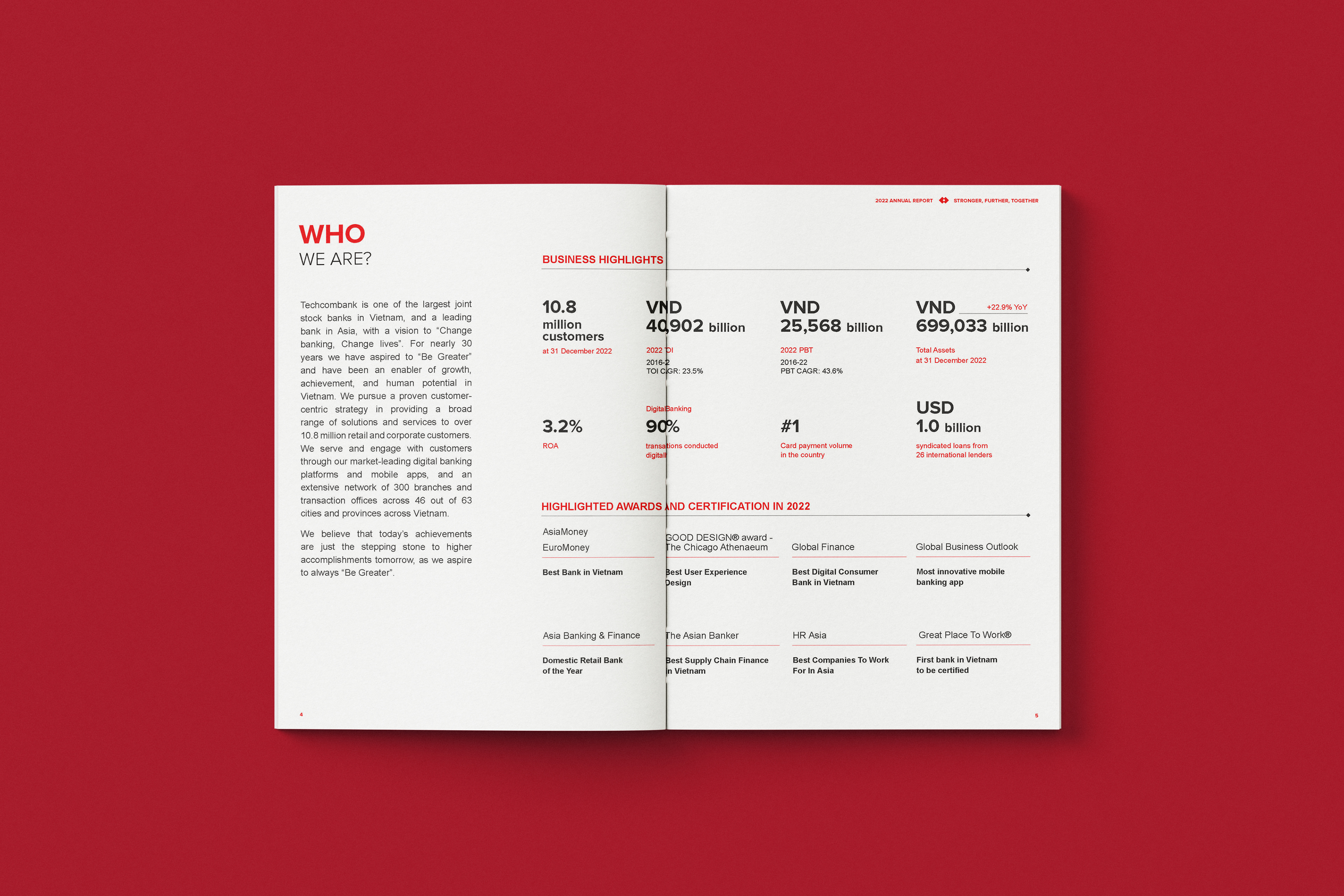
Các con số tài chính quan trọng được đẩy lên cỡ chữ cực đại (Super-sized Typography) với màu đỏ thương hiệu Techcombank, tạo ra những "điểm chạm" thị giác mạnh mẽ.
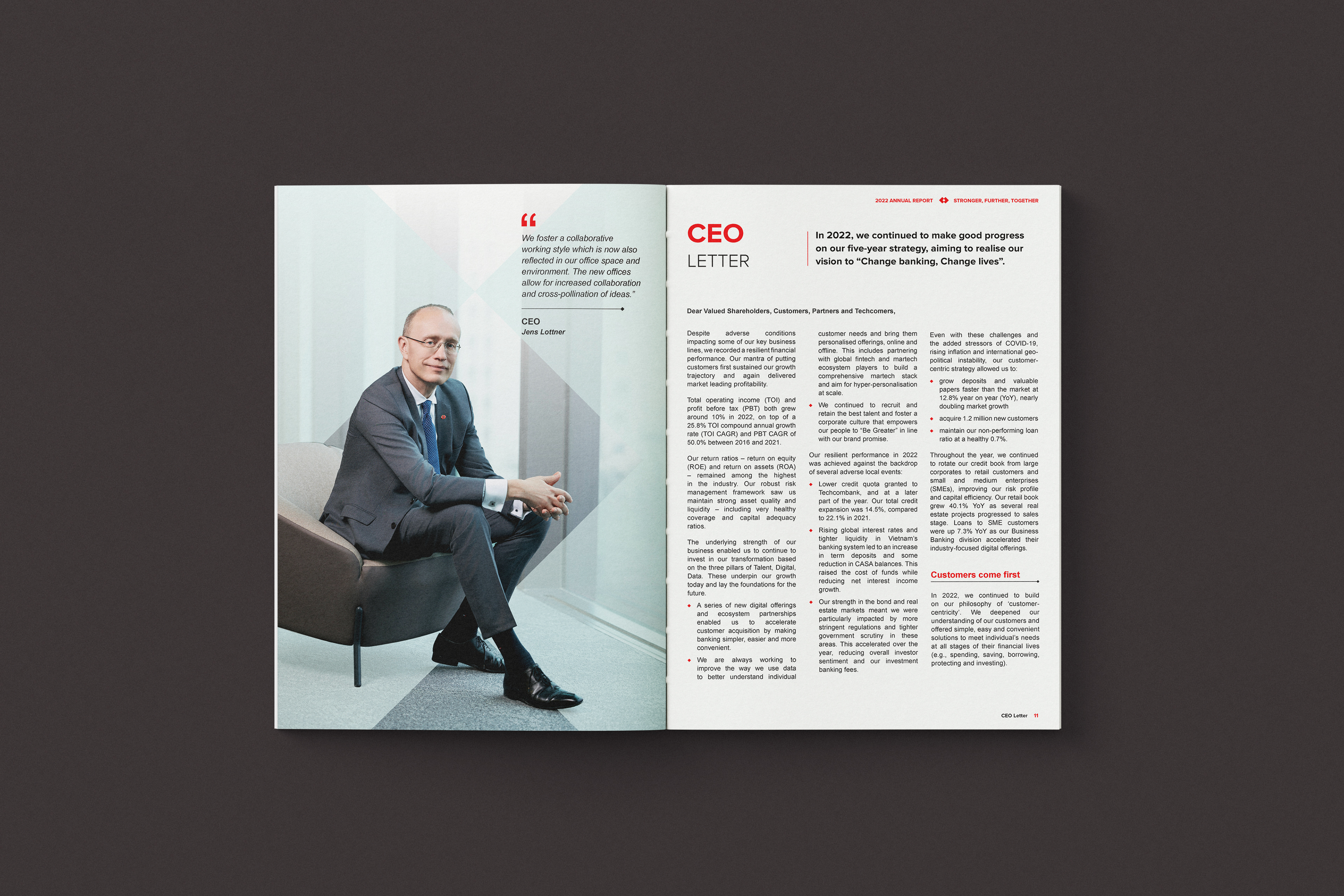
Các khối dữ liệu này được cân bằng lại bằng các khối văn bản dàn trang 3 cột (3-column grid) tinh gọn, giúp trang báo cáo không bị nặng nề dù chứa lượng thông tin khổng lồ.
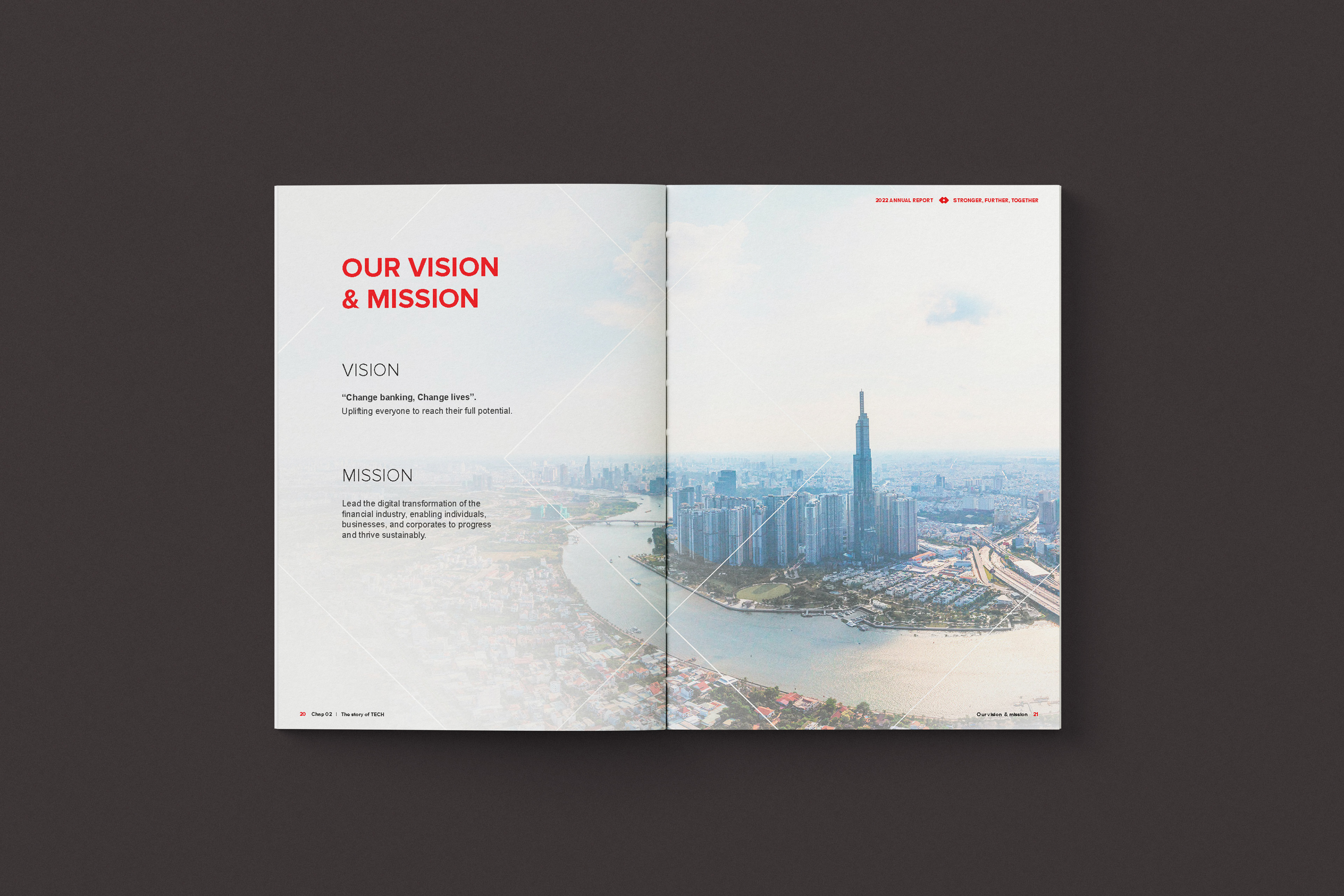
Sự tương phản giữa "Đặc" (Dữ liệu) và "Rỗng" (Khoảng trắng) là chìa khóa của sự sang trọng trong phong cách Editorial.
We utilize scale contrast to actively guide the reader's eye through the layout.
Key financial figures are amplified with super-sized typography in Techcombank’s signature brand red, creating powerful and immediate visual touchpoints.
These dense data blocks are meticulously balanced by sleek 3-column grid text layouts, ensuring the report remains airy and sophisticated despite the vast volume of information.
The deliberate contrast between "density" (data-heavy sections) and "void" (intentional white space) is the definitive key to editorial elegance in this project.
PROJECT CREDITS
Client: Techcombank
Concept & Creative Direction: MG Agency
Editorial Execution & Layout Systems: dotworks
TECHNICAL SPECIFICATIONS
Grid System: Classic 3-Column Modular Grid
Design Style: Corporate Editorial, High-Contrast Typography
Key Focus: Data Storytelling & Brand Identity Alignment